

.png?width=207&height=108&name=Mega%20menu%20%E2%80%93%20Featured%20Image%20Template%20(1).png)
 UK
UK
 France
 Germany
 Italy
Italy
 Spain
Spain
 Poland
.svg) Australia
Australia
 Japan
Japan
 USA
USA
 Canada


Data science is being used to solve the world's biggest problems, but all too often, the work is only accessible to a technical audience.
In a sense, communicating data science has never been easier — the Jupyter notebook has become the standard for creating and sharing interactive, computational stories. The notebook is a combination of narrative text, live code, and visualizations such that someone else could follow the flow of your work, reproduce the results, and tinker with it.
Most people believe that the work is done after publishing a notebook, not realizing that it still presents a barrier for the non-technical audience.
The live code is an integral aspect of the notebook, but it's also the most intimidating part for a non-technical person who has no way to interpret it. Further, the structure of the notebook often reflects the logic of the data workflow rather than the greater narrative of the work.
What are you missing out on when you only publish a notebook?
-
Notebooks don't cater to non-technical collaborators or recruiters.
Your work might have caught the attention of an inter-disciplinary collaborator with a fascinating extension in mind or a recruiter interested in hiring you. However, they struggle to get past the code and fully appreciate your work. - Notebooks don't translate to social platforms like Twitter/LinkedIn.
A notebook is not designed to quickly convey the gist of your work. In the digital world, not leading with a 60-second version of your work means that far fewer people will pay attention to it at all, technical or otherwise.
This is what we call the "last mile"of the data science workflow — going beyond a technical summary, and transforming your work into a format that's easy to understand and accessible to a wide range of people.
To meet these needs, we envision a new artifact called the datafolio.
Introducing the datafolio
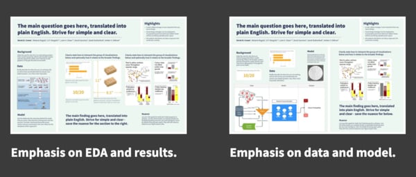
The datafolio is a single-page, visual snapshot of your data science work.
It's designed to:
- emphasize data storytelling and visualization over text-heavy explanation
- be easy for the audience to very quickly get the gist of the work
- be inviting and accessible for non-technical audiences
Let's unpack each of these.
Data storytelling and visualization
The datafolio places a heavy emphasis on data storytelling, or building a narrative around a set of data and its accompanying visualizations. We believe that this is critical for conveying the meaning of your work to a wide audience.
Wherever possible, we also encourage visual representations of the methods and results. Informative graphics, flowcharts, and other types of visualizations are both more engaging and condensed than text-based descriptions.
Quickly get the gist of the work
On the internet, attention spans are very short. People don't read everything they come across — they browse until they find something worth exploring further.
Media publications know this, which is why headlines are designed to leave you wanting to read more. Most data science work, however, has not adapted to this reality. Even the most curious reader will only allocate a few minutes to deciding if your work is something they're interested in.
The datafolio is designed to be easily skimmed and to quickly convey the important aspects of the work. The "highlights" gives the reader a 10 second run-down and invites them to spend more time with the rest of the content.
Accessible to non-technical audiences
More and more, data science work is being used and consumed by people who work outside data science.
The datafolio helps illuminate the work you've done in a format that non-technical audiences (like recruiters and potential collaborators) can better engage with.
How to make a datafolio
If you're sold on the datafolio or just want to learn more, we've put together a small library of templates and guidelines to get you started.
We're still experimenting with different formats and adding new templates and examples every week! For updates, inspiration, and resources — subscribe to The Story of Data, our weekly newsletter.