.png?width=207&height=108&name=Mega%20menu%20%E2%80%93%20Featured%20Image%20Template%20(1).png)
 UK
UK
 France
 Germany
 Italy
Italy
 Spain
Spain
 Poland
.svg) Australia
Australia
 Japan
Japan
 USA
USA
 Canada


Welcome to the first issue of The Story of Data. This is where we help you level up your data communication skills with learning resources and inspiration.
Resources
How to make visual, data-driven essays
The Pudding is an award-winning data journalism publication and they created this guide about approaching the design of visualizations. We really like the step-by-step approach and the examples of the essential process of iteration.
This article introduces a Python library that lets you easily build embeddable and sharable interactive reports. We think it's really important to create dynamic representations of your work that others can explore by modifying parameters.
This article covers best practices for visualizing different types of survey question types. A good review if you don't normally deal with this type of data.
Get Inspired
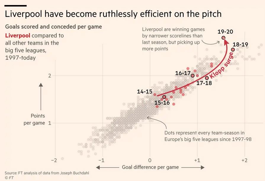
Liverpool on the cusp of Premier League glory
We really like the Financial Times annotated visualization of Liverpool's season.
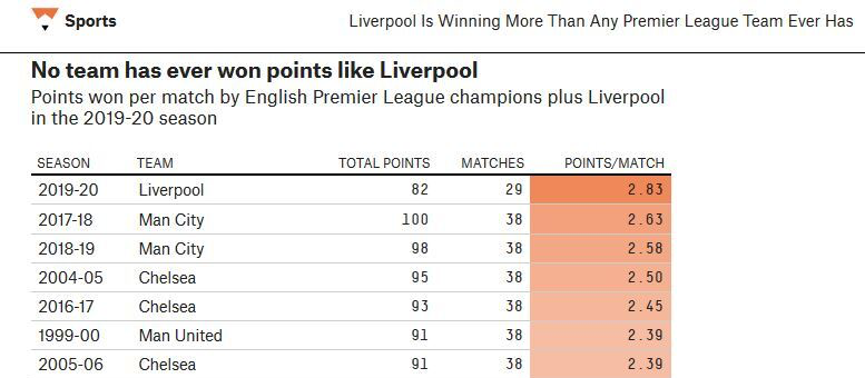
Compare that to FiveThirtyEight's coverage. A world of difference!
---
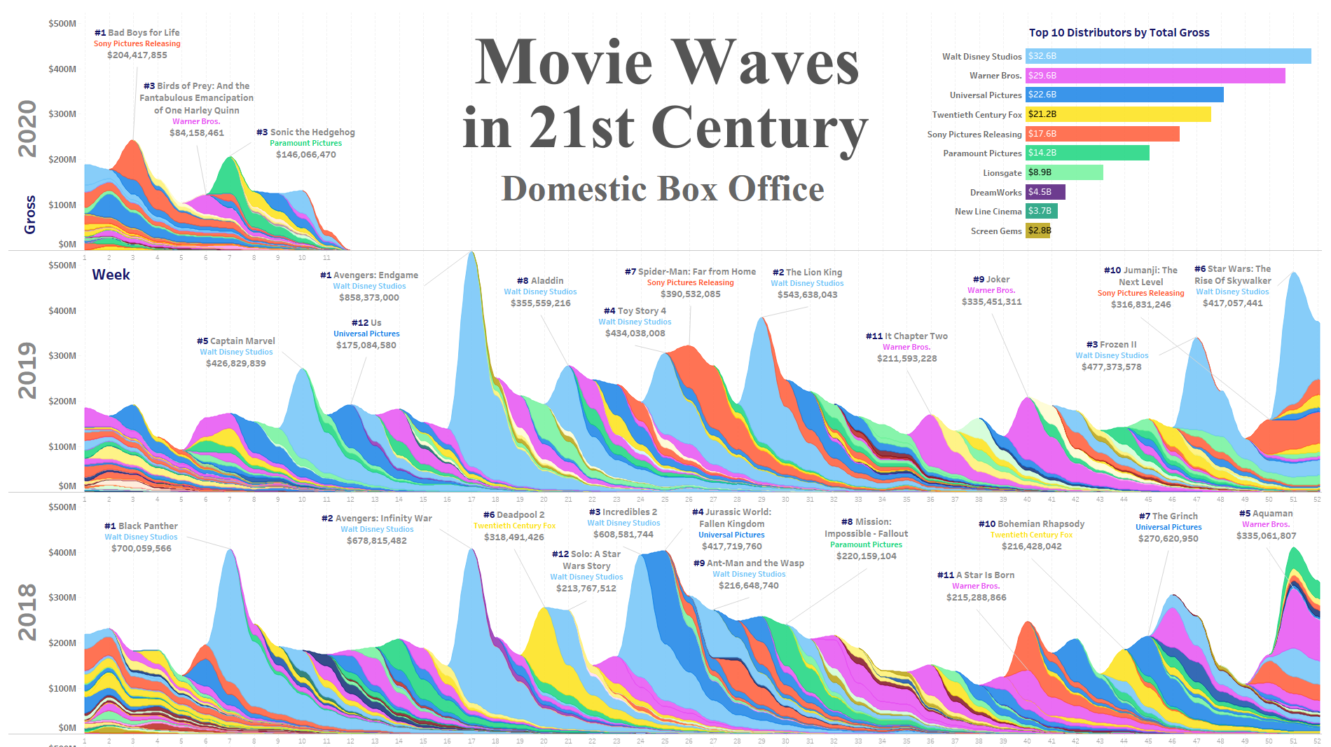
Movie Waves in 21st Century
Visualizing box office data is a pretty common project in data science, but we thought this was a fresh take on an old favorite.
---
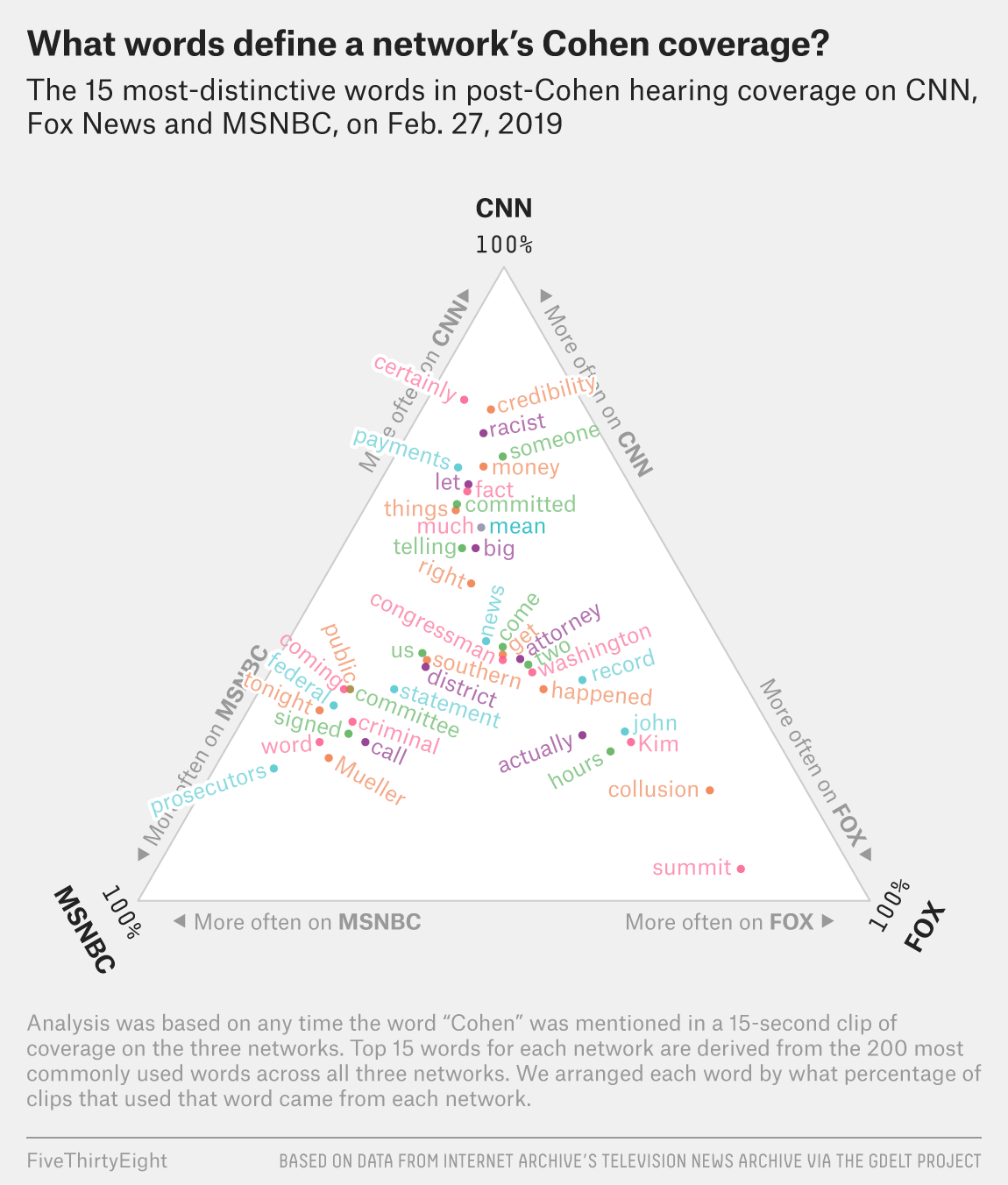
How Cable News Reacted To The Cohen Hearing
We felt bad for bashing on FiveThirtyEight earlier, so here's a really interesting way to depict word clouds from them.