.png?width=207&height=108&name=Mega%20menu%20%E2%80%93%20Featured%20Image%20Template%20(1).png)
 UK
UK
 France
 Germany
 Italy
Italy
 Spain
Spain
 Poland
.svg) Australia
Australia
 Japan
Japan
 USA
USA
 Canada


Welcome to Issue 3 of The Story of Data. This is where we help you level up your data communication skills with learning resources and inspiration.
Resources
The Problem with "By the Numbers" Infographics
Stephanie gives a humorous account of a basic concept - presenting data in isolation doesn't convey meaning. Context is how we get the meaning - through comparison to history, internal goals, or external benchmarks.
How is flooding affecting your community?
The Pudding took a newly-released dataset on flood risk and created a series of interactive charts and maps. They prioritized making it easy to embed these visualizations and it was featured in multiple publications.
Choosing colors for data visualization
People often overlook the impact of the colors they choose in their charts and graphs. We really like Lisa Rost's article that points out common mistakes and offers simple tips for communicating your data more effectively!
Get Inspired
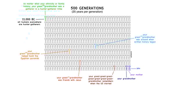
Everything we call civilization
Tim Urban is an expert storyteller that uses silly visualizations to get his points across. We love his depiction of history, complete with hilarious annotations.
---
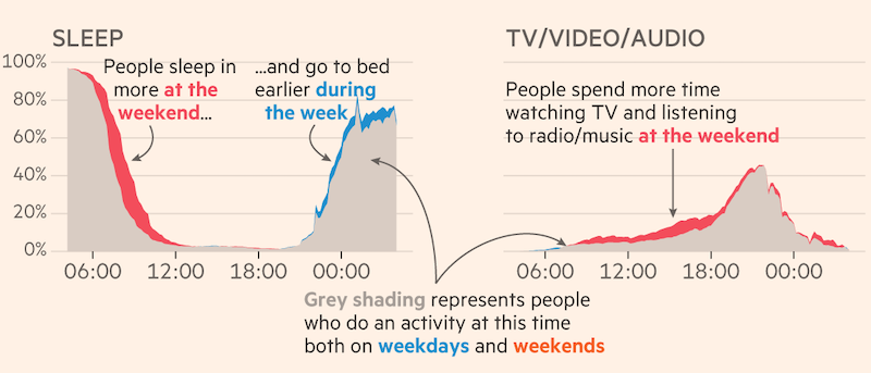
How britons spend their time at weekends vs weekdays
We really like the Financial Time's use of color to emphasize the differences in specific activities during weekends vs weekdays. It would otherwise be difficult to see the subtle contrast.
---
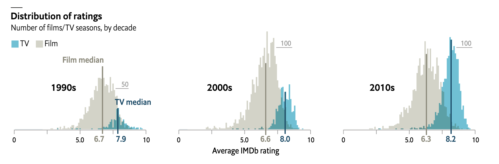
We liked the Economist's size-by-side comparison of TV and film ratings across 3 decades. It clearly shows TV shows' growth in volume, despite stagnant ratings.