.png?width=207&height=108&name=Mega%20menu%20%E2%80%93%20Featured%20Image%20Template%20(1).png)
 UK
UK
 France
 Germany
 Italy
Italy
 Spain
Spain
 Poland
.svg) Australia
Australia
 Japan
Japan
 USA
USA
 Canada


Welcome to Issue 4 of The Story of Data. This is where we help you level up your data communication skills with learning resources and inspiration.
Resources
Racial demographic dot density map
This notebook breaks down how the author generated the dot density maps in his Washington Post article. Each dot represents 10 people mapped onto census block groups (the smallest geography used in the census).
This piece elaborates on best practices for presenting your insights virtually. We particularly like the suggestion around using a spotlighting pointer as well as the concept of building complex charts slowly.
Common mistakes with violin plots
When generating violin plots, this article suggests ordering by median value for clarity as well as adopting a horizontal layout when labels are long. It also explores when you should consider other graph types (e.g. ridgeline, boxplot).
Get Inspired
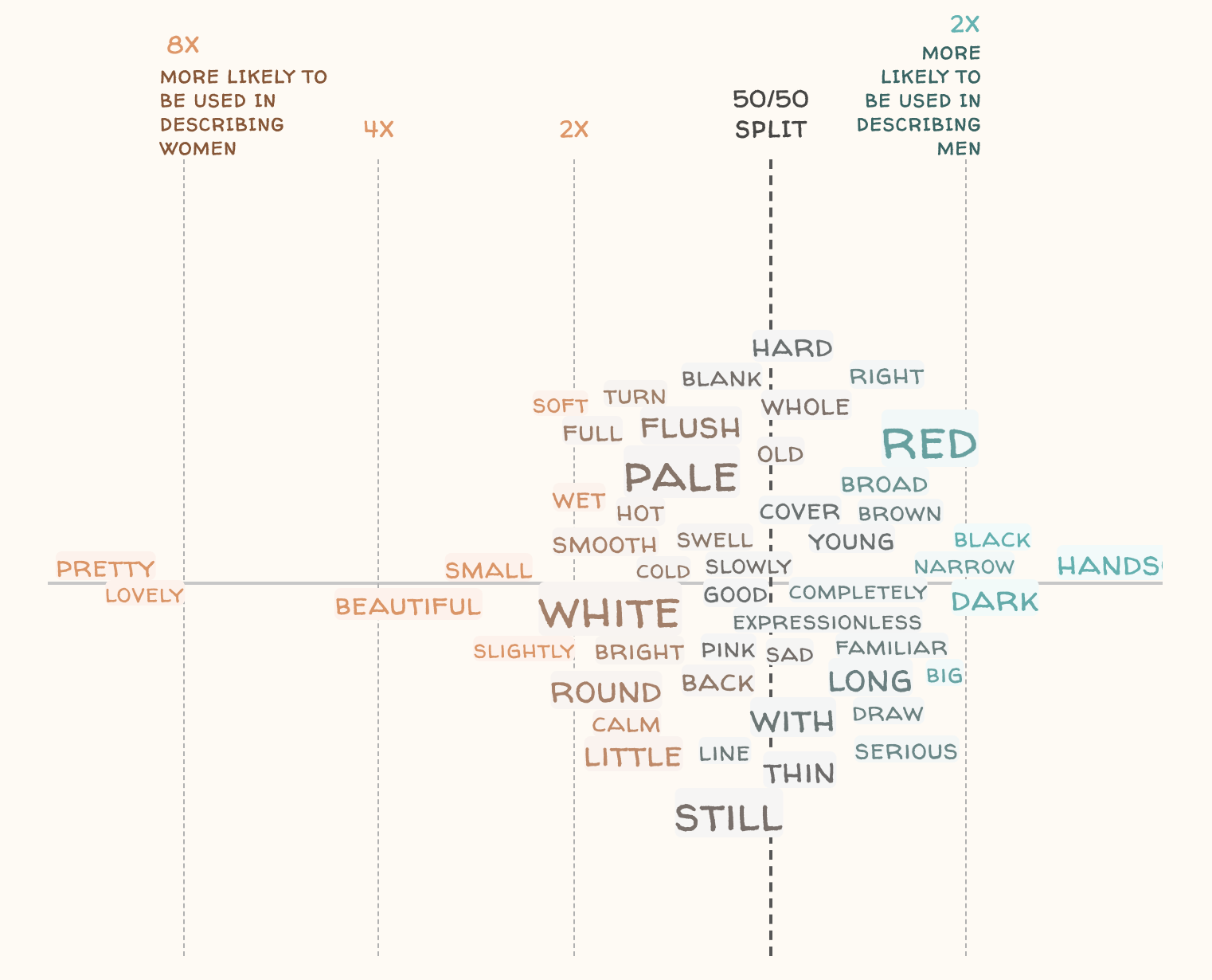
How faces are described in literature
This is a creative visualization of the output of NLP, with a log scale depicting how often either men or women's faces are described with a certain word.
---
We love this graphic from Cole Knaflic - in her words, "don't simply show data���tell a story that affords understanding & inspires action!"
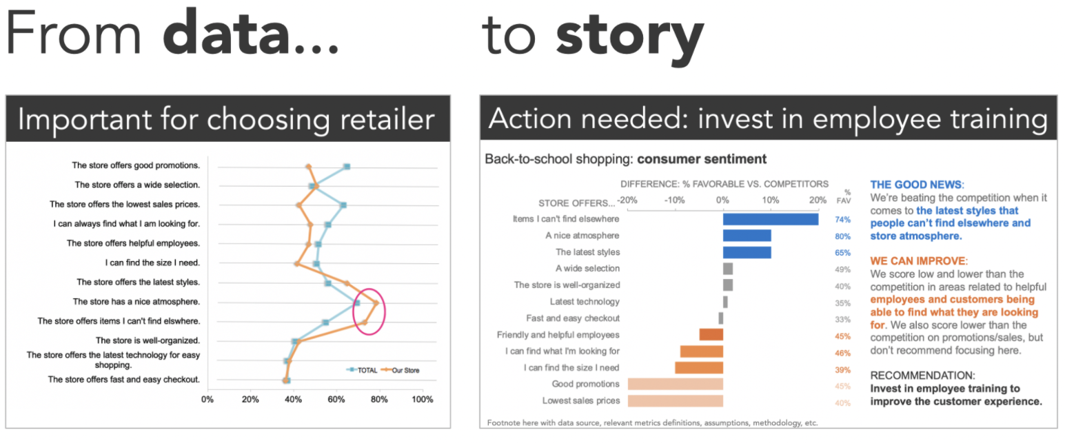
---
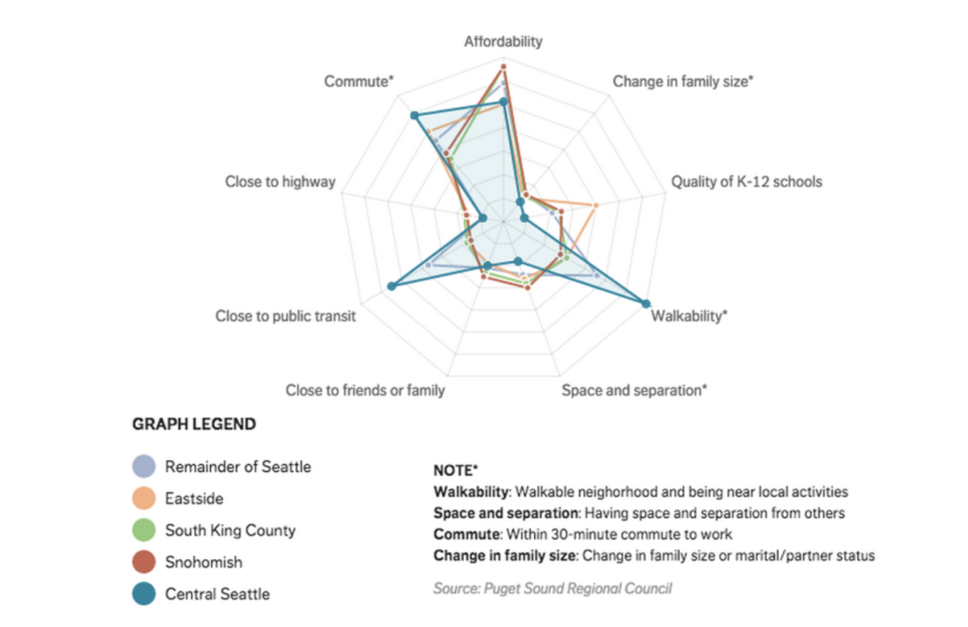
How Seattle Residents Determine Housing
We really liked the use of the radar chart to depict the primary factors Seattle Residents consider in different parts of the city.