.png?width=207&height=108&name=Mega%20menu%20%E2%80%93%20Featured%20Image%20Template%20(1).png)
 UK
UK
 France
 Germany
 Italy
Italy
 Spain
Spain
 Poland
.svg) Australia
Australia
 Japan
Japan
 USA
USA
 Canada


Welcome to Issue 2 of The Story of Data. This is where we help you level up your data communication skills with learning resources and inspiration.
Resources
It's fairly rare but valuable for individuals to take the time to create a dataset. If you do, this article serves a model for how to describe the process, explore the dataset, and embed an interactive list for other's to experiment with!
Giving a voice to the vulnerable with data storytelling
The European Journalism Centre published an article on presenting data that relates to marginalized, silenced communities. While it relates to journalism, we think everyone who works with data should give it a read.
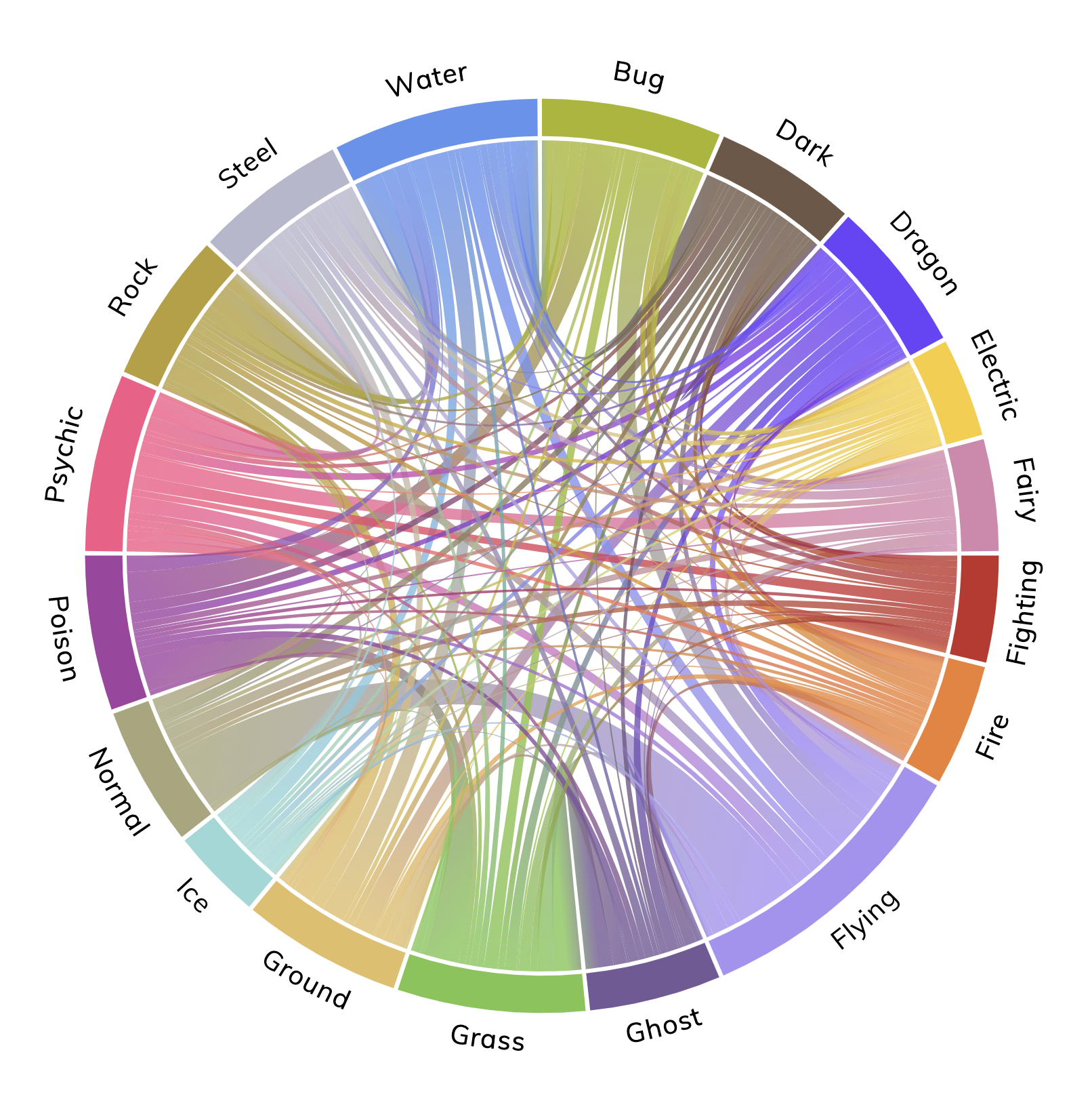
Common mistakes with chord diagrams
Chord diagrams have risen in popularity recently, but people commonly misuse them. This short article emphasizes reducing the number of arc crossings, avoiding over-cluttering, and providing plenty of context for the diagram.
Get Inspired
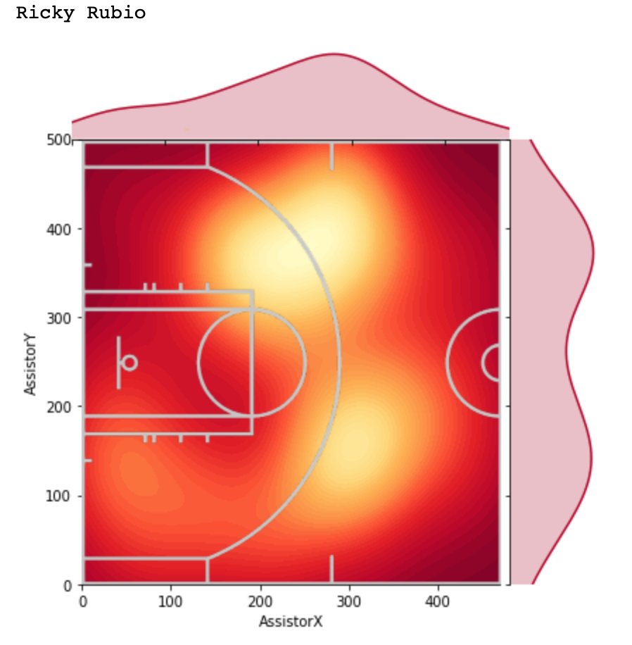
A simple and clever overlay of the basketball court over a heat map of where a player's assists come from. Makes it much more intuitive to interpret!
---
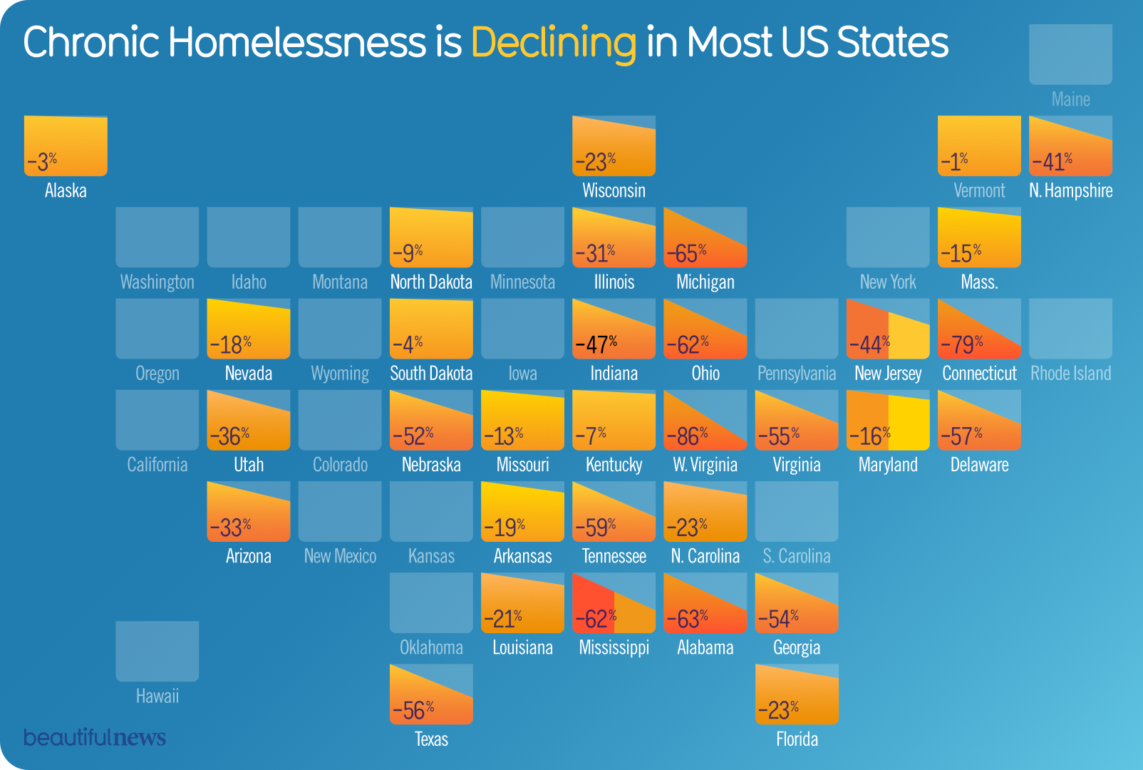
Chronic homelessness in US states
This is a very custom graphic, but the combination of color, text, and incline to indicate the degree of homelessness decline caught our eye.
As we noted above, chord diagrams are a popular option for depicting flows or connections of nodes. It can depict many things, including Pokemon types!